
I collaborated with Swap It, a car show app designed to bring enthusiasts together, to establish a strong and recognizable visual identity. My work centered on creating the logo and developing the brand’s overall look and feel.

Logo & Branding
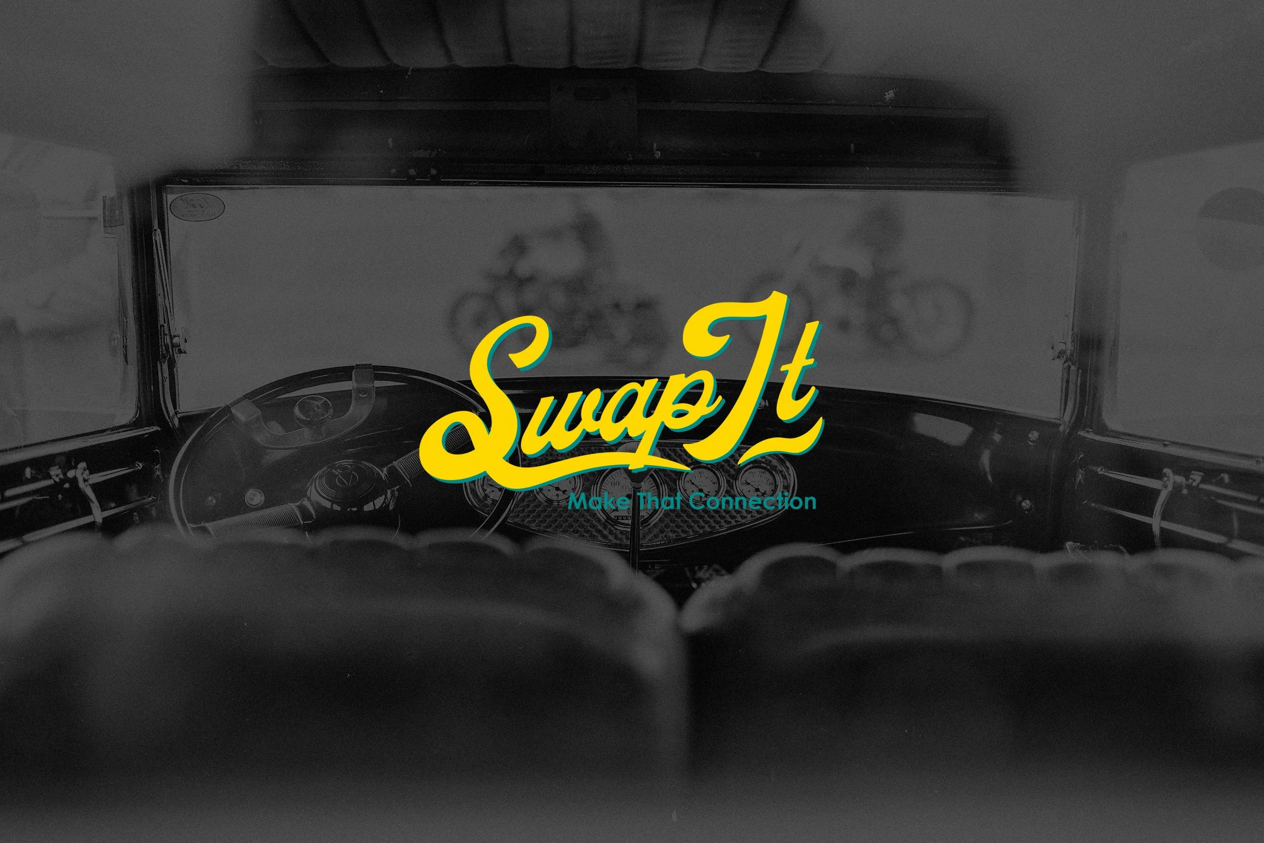
The Swap It logo was designed to capture the spirit of connection and automotive culture. Using bold, retro-inspired typography with a vibrant yellow and teal color palette, the branding communicates both energy and nostalgia—qualities that resonate with the car enthusiast community.
The tagline, “Make That Connection,” reinforces the brand’s mission while pairing seamlessly with the visual identity. The logo was designed to be versatile and impactful across digital, print, and merchandise applications.
Applications
To showcase brand flexibility and recognition, the logo and branding were extended across multiple touchpoints, including:
Event Assets: Banners and promotional graphics that highlight Swap It’s identity.
Digital Presence: App branding and marketing visuals that emphasize community connection.
Merchandise: T-shirt designs that integrate the logo, tagline, and car illustrations, creating a strong brand presence at shows and events.