

I collaborated with Sweat Sanctuary, a fitness and wellness brand, to create a distinct and modern visual identity that balances strength with serenity. My work included designing the logo, defining the color palette, and establishing cohesive branding guidelines.


Logo & Branding
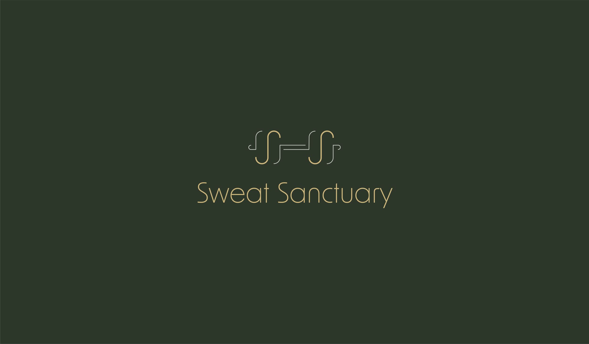
The Sweat Sanctuary logo combines bold simplicity with symbolic strength. The initials “SS” were paired with barbell-inspired shapes to subtly reflect fitness while maintaining a minimalist aesthetic. The logo was designed in multiple variations (vertical, horizontal, dark, and light backgrounds) to ensure versatility across applications.
The chosen color palette—deep forest green, muted gold, soft gray, and blush—communicates both energy and calm, capturing the essence of Sweat Sanctuary as a space where hard work meets balance.
Typography was set with New Order Light and New Order Regular, blending elegance with clarity, reinforcing the brand’s modern and approachable tone.
Applications
The branding system was designed to be flexible and adaptable, supporting:
Digital Presence: Clean, professional visuals for the website and social media platforms.
Studio Materials: Logos and colors ready for signage, promotional posters, and class schedules.
Merchandise: Apparel and accessories that carry the brand’s sophisticated and fitness-forward aesthetic.