Brand Identity & Visual System
-
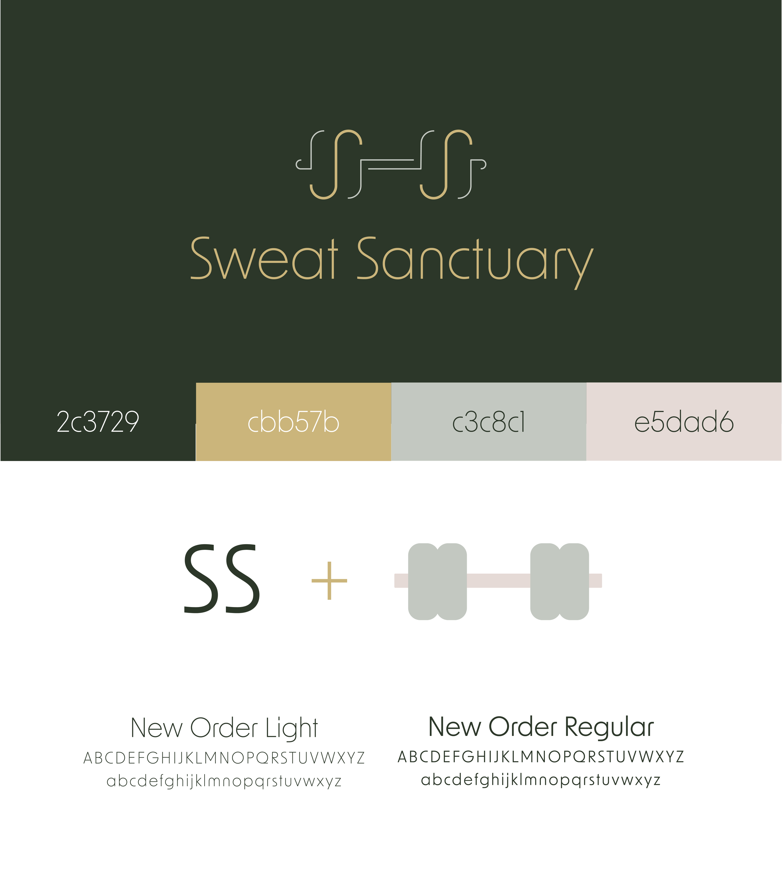
I was honored when The Sweat Sanctuary, a fitness and wellness brand, tasked me to design a distinct and modern visual identity for their first gym. They wanted a brand that balanced strength and serenity. The goal was to create a cohesive system that reflects the brand’s philosophy of physical effort meeting inner calm.
-
As the Contract Designer and Brand Developer, I led the creation of the logo, color palette, and full brand guidelines.
Logo Design: Designed a minimalist mark combining the initials “SS” with barbell-inspired forms, symbolizing both movement and balance. Created multiple logo variations (vertical, horizontal, dark, and light) for flexibility across digital and physical applications.
Color Palette: Selected a refined combination of deep forest green, muted gold, soft gray, and blush, expressing energy, sophistication, and calm.
Typography: Paired New Order Light and New Order Regular to achieve a clean, modern typographic style that conveys professionalism and approachability.
Applications: Designed cohesive assets for web and social platforms, studio signage, promotional materials, and branded merchandise.
-
The new identity established a premium yet approachable look for Sweat Sanctuary, aligning its visual communication with its mission to create a restorative, empowering environment. The branding system delivers flexibility, elegance, and consistency across every touchpoint—from digital content to in-studio materials.
-
Illustator
Photoshop